Wednesday 5 May 2010

Evaluation

1. In what was does your media product use, develop or challenge forms and conventions of real media products?
our media project conveys to most of the conventions of a thriller opening. For example, suspense, mixtures of fast and slow editing, and also action. We did this so it keeps our target audience’s attention. Although our piece does not differ from a normal thriller, it uses the conventions to create sequence that the audience will enjoy but still sticks with the conventions associated with this genre. The music we used was created by us as we knew that we wanted to create a very eery sound that we knew we wouldn't be able to create if we didn't make it ourselves.


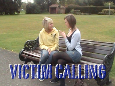
title of the film
We chose victim calling as our title of our thriller because it involves the typical traits of one. however, we put a twist on the name because it reverses the story line in the sense of you don’t expect the ‘victim’ to be the one making the phone calls.


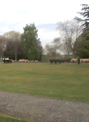
setting/location
We chose the park as our location and setting for our thriller because it has all the general aspects to what you would normally find in a thriller. For example, the big open space surround by woodland gave the opening of our thriller an eery feel. Also the dark and gloomy weather creates a very mysterious feel which you could not achieve if it was filmed in a closed off space.


Costumes and props
The costumes and props we used for our thriller were a hooded jacket and a mobile phone. We used these props because they were key parts in our thriller to show the differences between social groups. For example, the hooded jacket is used on one of our characters to automatically give the audiences a sense of threat towards him because he is dressed suspiciously. We used the mobile phone as this played an important part of our thriller. Without using a mobile phone, our thriller would not have made sense.
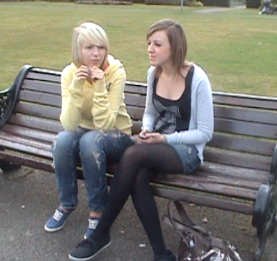


Camerawork and editing
Although we used basic camerawork throughout our thriller, we tried to create a lot of continuous shots which worked quite well. For example, the transition from the phone in the girls hand to her putting the phone in her bag. Even though there was a few mistakes that were made, the editing helped phase out a few of them with cutting slightly before the mistake was made.


Title font and style
we used basic fonts for our opening sequence which we created on live type because we found a lot of the actual live fonts were too bright and not did not match the ambience we were trying to create.


Story and how the opening sets it up
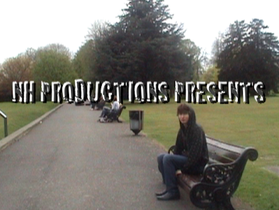
Our story is based around a mobile phone and how stealing it leads to serious consequences. the opening sets this up because of the set up of the shot and how we have portrayed each character. For example, the boy is wearing dark clothing and a hooded jacket which gives the impression that he is trouble. Whereas the two girls on the bench are wearing bright clothing and they’re giving off positive body language.


Genre and how the opening suggests it
The genre of our opening is a thriller and this is suggested by the whole mise en scene of the beginning. For example, the non-diagetic sounds create an eery feel as well as the opening credits and the fonts that have been used and the video transitions used are also helped to give the impression that it is a thriller.


How characters are introduced
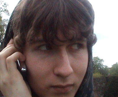
The characters are introduced through the different shots, which are used to associate them with a particular role. For example, the boy has lots of close up shots of his eyes to show how he is suspicious.


2. How does your media product represent particular social groups?

Our thriller opening’s characters are all different from one another and are portrayed in ways to make us have a certain opinion of them, for example, the main social group represented is young adults however we have divided up this social group into two different ways, good and bad. The characters in our thriller are of the same age as our target audience which makes the sequence connect to our audience more than others.

3. What kind of media institution might distribute your media product and why?
There are quite a few institutions which would like to create a thriller with the target audience of both younger and older people as the more audience targeted than the larger the gross income. For example, Working Title produced a film called ‘Thirteen’ which had a large majority of younger cast members. However, it still appeals to a large audience as it had hard hitting facts about young teenagers lives and how their parents coped.

4. Who would be the audience for your media product?
Based on the fact that our opening has young adults starring in it I would expect the typical age of our target audience to be mainly females of ages 15+. We feel it would attract a female audience because it is about revenge in the sense that women can stand up for themselves.

5. How did you attract/address your audience?
The main attraction to our target audience is the fact that the characters are their age and some of them reflect how the audience behaves. In the mise en scene aspects we chose our characters to be portrayed in certain ways by the clothes they wear.

6. What have you learnt about technologies from the process of constructing the product?
During the planning, filming and editing stages of our opening thriller we learnt how to combine various technologies to create a plausible final product. We like the fact that we filmed ours off of college premises and outside of college hours as we thought that it would gave it a more realistic feel. We edited and changed sounds in the video using Final Cut Pro to create the best opening we could. Through using all of these various technologies we have learnt that we need to pay a lot of attention to detail to create the best opening sequence possible.


7. Looking back to you preliminary task, what do you feel that you have learnt in the progression from it to the full product?
We feel that we have learnt alot since filming the preliminary task to filming our opening sequence. We learnt lots of valuable lessons whilst considering all the different technicalities and complicated circumstances we had to overcome when creating our opening sequence. We feel we have learnt how to film better and use a larger variety of shots as well as filming off of school premises to create a more realistic feel to the thriller. 


Thriller Opening


CLICK TO ENLARGE!!!

Planning Our Opening Thriller

title of the film: victim calling

setting/location: sidcup place

costumes and props: hooded jacket, a mobile phone and a mask.

camerawork and editing: close up shot, mid shot, point of view shot, long shot

title font and style: bold, font: cracked big, stand out, quick on screen and disappears quickly.

story and how the opening sets it up: 2 young adults are in a park sitting down on a bench and talking. A male young adult in a hooded jacket sits on a bench next to the girls. He sees one of the girls mobile phone in her hand and keeps looking at the phone. The girl puts her phone in her bag and carries on talking. The boy walks past and slyly takes the phone out of the bag as he walks towards them, he then runs. As the boy stops runnng and starts walking over the field he recieves a phone call from an unknown number on the phone he just stole. He answers it and a woman answers saying "you think you got away with this don't you." A close up of the boys confusion on his face is used and then the woman continues speaking and says "turns out you're the victim, you and your girlfriend." The boy immediately puts the phone down in fear and as he does the wallpaper has changed to a picture of him and his girlfriend.

genre and how the opening suggests it: thriller, there is stealing, curiosity, mystery, fear and death involved.

how characters are introduced: By a variety of shots which show each characters personalities even if you do not hear them speak.

special effects: none

Questionnaire and Results


Tuesday 4 May 2010

Preliminary Task New


CLICK ON IMAGE TO ENLARGE!!!


Tuesday 2 March 2010

Comparing The Openings Of Panic Room And Se7en

The main similarity between the opening sequences for Se7en and Panic Room is the music, although its not the same instruments used, the same eery feeling is found on both, the differences include the camera shots used, for example, in se7en they make the opening credits on a black background and incorporate it into the film to swap from the opening video to the credits. In contrast panic room has edited the opening credits onto the buildings so that they do not have to cut between shots of landscapes of new york and the opening credits. Both of these work due to the face that they have been cleverly edited which has created really eye-catching opening sequences.


Another comparison is the difference in shots used for example in panic room a majority of the shots used are long shot of new york city, whereas in se7en they use close-up shots of hands and the camera follows what they are doing.


Lastly the way in which the title of the sequence is shown is different on both of the films, in seven the title is very distorted and hard to read, it also only flashes up on the screen briefly then goes away. In contrast, panic rooms title is very grand and easy to read and stay on screen for quite a while.

Opening Sequence Analysis of se7en


Camera Shot/Angle/Movement

The camera shots are very close up and are of strange, weird things. The shots make it seem more spooky and mysterious to us as we do not know what the point is. They are also sometimes at the view that we are looking at what he sees or at a birds eye view. The shots are also sometimes blurred which creates effect. The movement has a rhythm yet still sets the scene of it being creepy and strange. For example we will see a shot and then it will suddenly be a black screen with one set of credits which will come up and then expand and blur then randomly go to a next strange shot. Even though it happens throughout the opening, it still surprises us because we are so intrigued as to what all these shots are about. Also some shots near the end are the same and last longer than other shots. For example there is a shot with a pen being used to delete or highlight specific words and we then see it again being used to draw a line through a picture of a boy and then the next shot is of the whole face scribbled in the same black ink. This shot alone gives us a sense of worry and makes us feel tense as we have no clue as to what this means and the sound with this shot makes us automatically think that this is strange and creepy. 


Sound

The sound which is used is non diegetic and creates the mood and gives us a sense of suspense. The sounds are different and have just been simply put together. We also can recognize all of the sounds yet they still manage to make us feel scared. The sounds include things such as someone typing, a bag being zipped up. There is also a slight beat and rhythm throughout and we get random repeats of the mysterious sounds we hear at the beginning. At first i notice that the sound was slow and quiet and then when it gets to about a minute on. The sound mates with the shots and is quick and loud and more random. At the very end there is a completely different piece of sound which is so strange and does not go with the scene that is represented throughout this opening. Because it does not match and is very short, it creates a sense of mystery and confusion.


Editing

In the opening sequence, there are many cuts throughout which have a mixture of being very short and blunt or long and strange. the cuts set the scene as being suspicious. without the cuts i do not think the opening would not be as interesting as it is now. The cuts get longer and longer throughout the opening to try and tell the story a little bit better and create more suspense. for example right at the beginning of the opening the cuts are short and blunt and have no meaning compared to the cuts at the end. the cuts at the end are longer and are shots of someone doing specific things such as writing, cutting pieces of paper etc. 


Mise en Scene

The lighting in se7en is dark and it is hard for us to see everything that is being shown. This lighting gives us the effect of it being more scary and mysterious. We also only see one character and that character is also mysterious to us too. Also, because the setting is surrounded in violence it makes it more scary and eery for us because we cannot identify the character doing all of these weird, strange things.


Characters

There is only one character shown to us in the opening sequence. however, we never see this characters face or learn anything about him. we also automatically assume that the character is a male and is the villain in this film as all the violence and strange things that is being done, is what this character is doing. even though we cannot see this character we are anxious and scared of him as we cannot see his image, we only see his fingers and hands when he is doing these things.


Locations

In se7en we do not know the location in which se7en is set. The location is almost a mystery to us just as everything else is so far. Also, we are not really concerned about where all of this is being taken as there are other more suspicious things happening in the opening sequence. We can assume that the location is always in the same place throughout the opening because there is no dramatic change of scene which is obvious to us as the audience. 


Narrative/Plot

From just watching the opening of se7en, there is no obvious plot or story to what we see at the beginning. We can clearly see that this is a scary and mysterious film where we as the audience must figure out the plot and that is what makes the opening so interesting. We automatically assume lots of different things such as the man in the opening who is doing all of these things is the murderer or the evil, sick person in the film. All different things run through the audience’s minds because there are so many different interpretations and views to be seen.


Themes

Although the theme of se7en is not very recognizable, from the images, objects and sounds we can assume that the themes associated with se7en are death, serial killers, mystery, crime, adventure.


Visual Style

The way we view the opening of se7en is completely different to the way we would view any other opening of a film. this is because most other films are not as strange and mysterious as se7en is. Usually, when we watch an opening to a film we get a basic idea as to what will happen so we can decide whether we will enjoy the film or not and whether to watch it all the way through. However, when we watch the opening to se7en, we do not understand what is happening and nothing makes sense to us, but we automatically are engaged to it and are intrigued to find out what is going on. In certain films you do need a certain amount of information to get you hooked. but for se7en, the total opposite is needed and works brilliantly. 


Genre

The theme of se7en is a thriller because there is a mysterious and spooky atmosphere that has been set to thrill us. Also, there is no direct story or plot but just strange clips and sounds which is exactly what thrillers consist of to keep the audience interested.